LCG Analysis and Education Centre
LCG Analysis and Education Centre
LCG Analysis and Education Centre
LCG Analysis and Education Centre
LCG Analysis and Education Centre
Website
Overview
Create a useful minisite
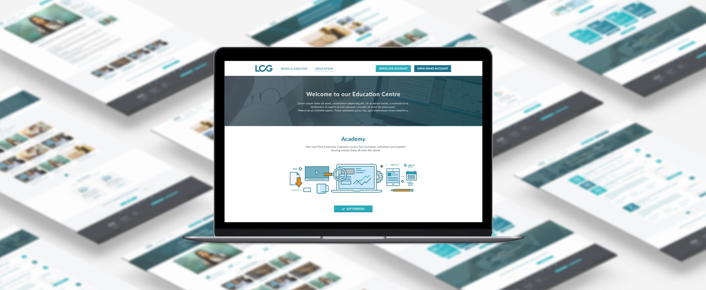
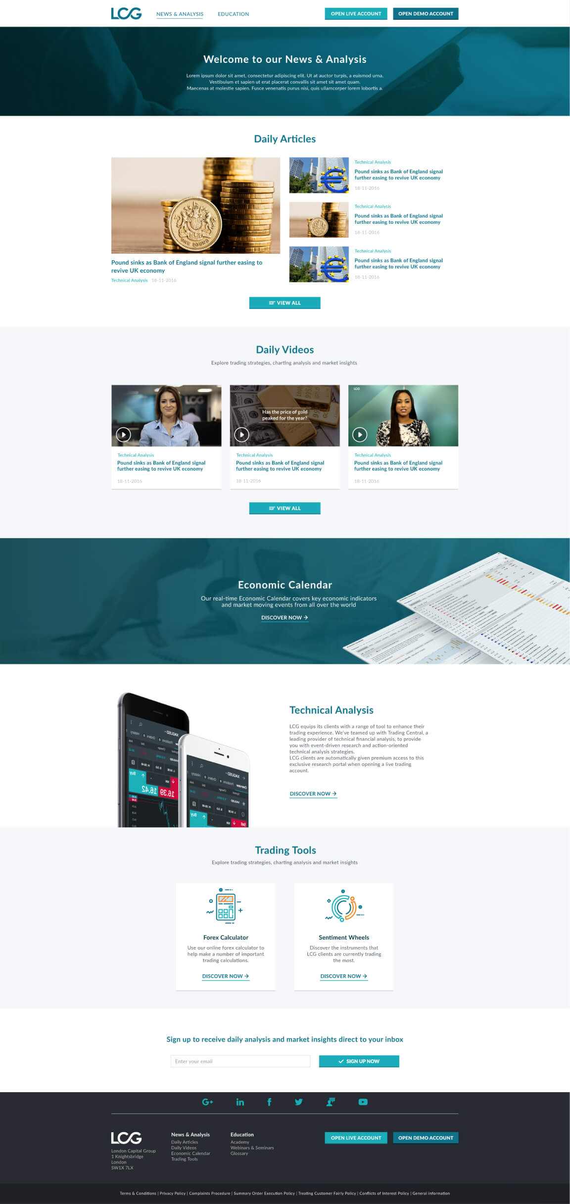
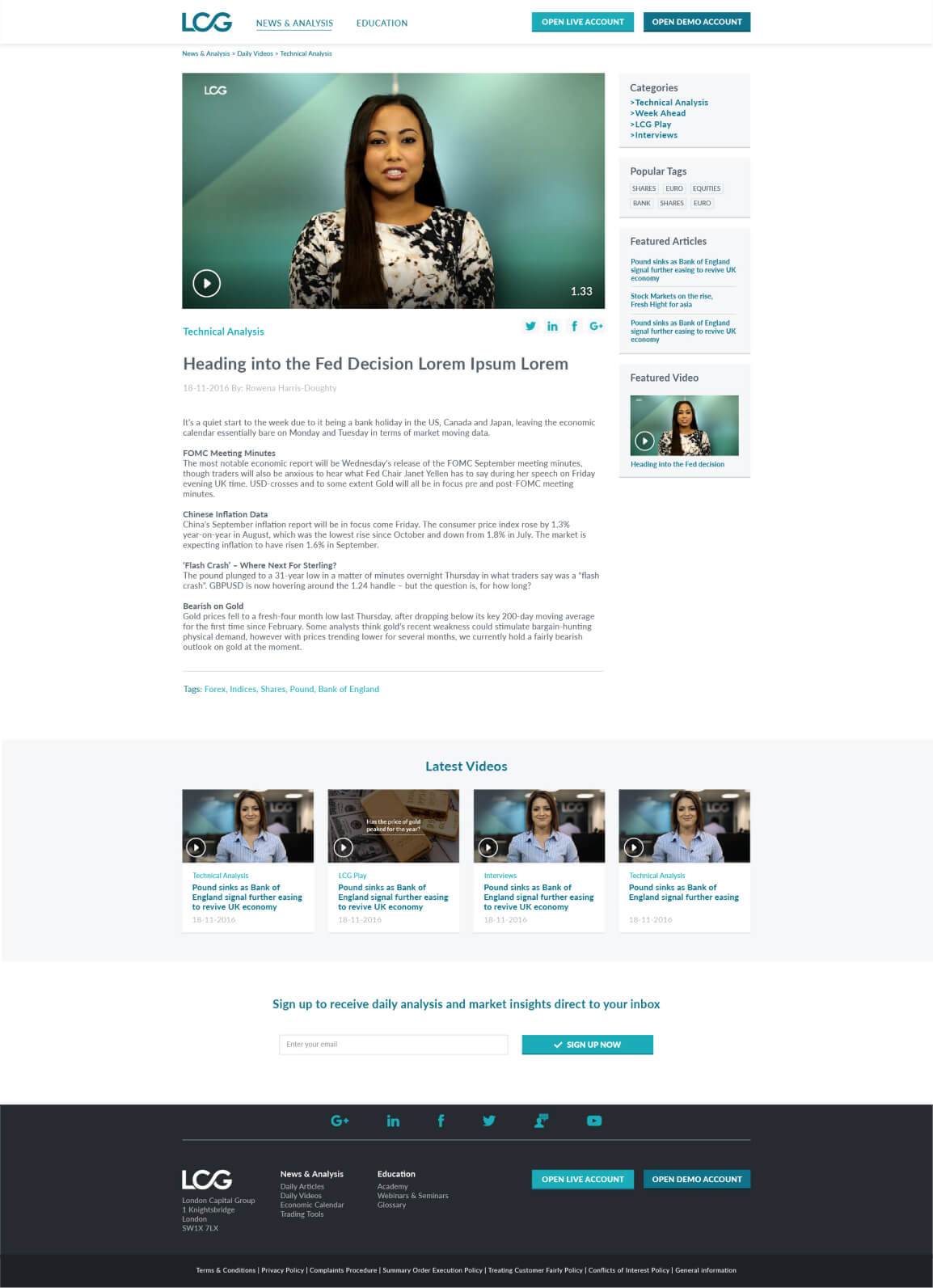
While working at LCG I was asked to design the new Analysis and Education Centre. The aim of the project was to get users from the main site to the minisite via two different access points - the News and Analysis section and the Education section.
While working at LCG I was asked to design the new Analysis and Education Centre. The aim of the project was to get users from the main site to the minisite via two different access points - the News and Analysis section and the Education section.
Year
2017
Role
Web/UX Designer
The Challenge
The main issue was how to get the user to the right content in the least possible steps. A clear path was needed for the user, which became more complicated as there were two target audiences to think about – the novice trader and the experienced trader.
The main issue was how to get the user to the right content in the least possible steps. A clear path was needed for the user, which became more complicated as there were two target audiences to think about – the novice trader and the experienced trader.
The main issue was how to get the user to the right content in the least possible steps. A clear path was needed for the user, which became more complicated as there were two target audiences to think about – the novice trader and the experienced trader.
The main issue was how to get the user to the right content in the least possible steps. A clear path was needed for the user, which became more complicated as there were two target audiences to think about – the novice trader and the experienced trader.

The approach
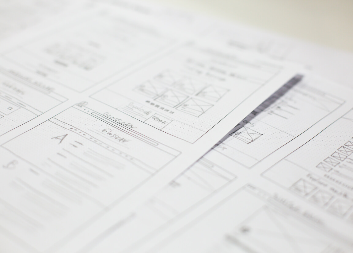
As the deadline was tight, I had to sketch some low-fi mock-ups with the analysts and media managers in order to design the best and easiest path through the page flows and the user journey.
After having the sitemap approved, I began working on the design with continuous feedback from the analysts and other people from the sales team about the flow and how the information would be accessed from a trader’s perspective. In the meantime I was taking the path of the ‘regular user’, trying to make the content and the layout easy to understand and accessible.
The solution
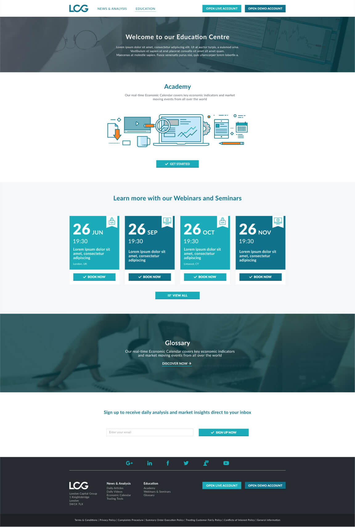
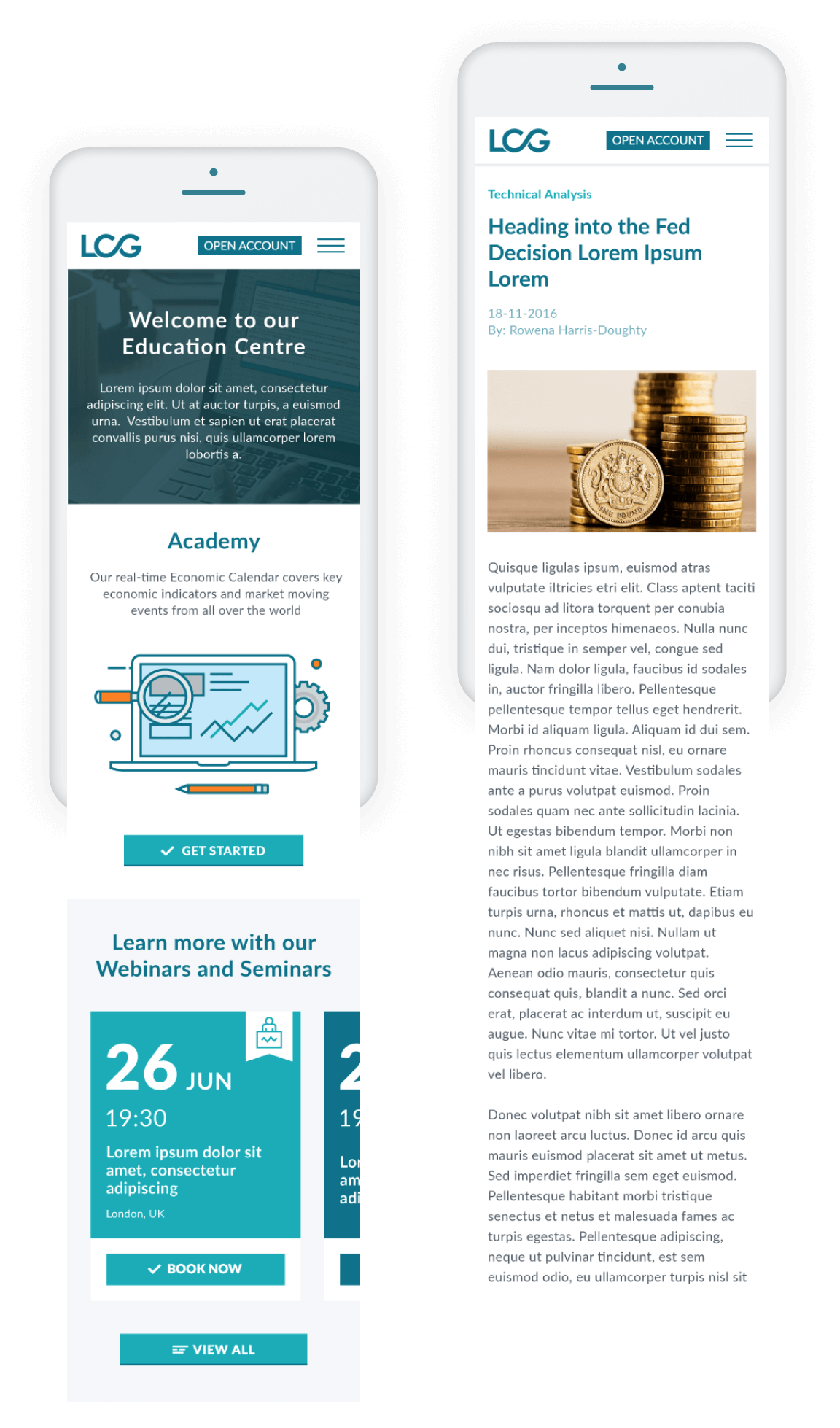
After several meetings and various feedback sessions, I first presented the sitemap showing the page levels and categories. By explaining the layout structure and the user flow, I then demonstrated the decisions taken during the design process.